
Composition Is What Separates a Photo from a Snapshot
It’s easy to assume a great photo mostly comes down to gear, a newer camera, a faster lens, a bigger sensor. Those things help, but they’re not what makes an image actually work. Two people can stand in the same spot with the exact same camera and walk away with completely different results. The difference almost always comes down to how each of them arranged the elements inside the frame.
There’s a real difference between taking a photo and composing an image. Taking a photo is pointing the camera at something interesting and pressing the button. Composing means deciding, before that button ever gets pressed, where every element sits in the frame, what’s in, what’s left out, where the viewer’s eye gets pulled, and what the image actually needs to say. It’s a decision, not an accident.
The good news is composition is a skill, not a talent you’re born with. There are principles tested for centuries in painting, architecture, and, more recently, photography, that help organize a scene so it reads as balanced and intentional. This article covers the big ones: the rule of thirds, the golden ratio, horizon alignment, leading lines, natural framing, negative space, and when it actually makes sense to break these rules on purpose.
Table of Contents
- The Rule of Thirds
- The Golden Ratio
- Horizon Line and Alignment
- Other Key Principles
- When to Break the Rules
The Rule of Thirds
The rule of thirds is the starting point for pretty much every study of composition out there. The idea is simple: split the frame into three equal parts horizontally and three vertically, forming a nine-section grid, like a tic-tac-toe board. The four points where those lines cross are called power points, because that’s where the human eye instinctively looks first for the main subject in an image.
In practice, that means avoiding parking your subject dead center every time. Instead, place the main element along one of those lines, or better yet, right on one of the four intersections. Most cameras, even entry-level ones, let you turn on a 3×3 grid overlay in the viewfinder or on the screen, which makes it a lot easier to see these divisions while you’re framing the shot.
For landscapes, the rule usually applies to the horizon line: placing it in the lower third emphasizes the sky, while the upper third emphasizes the foreground. For portraits, a subject’s eyes tend to work well lined up with one of the upper power points. In action shots, like sports, it’s worth leaving space in the direction your subject is moving: if an athlete is running toward the right of the frame, put them on the left third instead, with open space in front of them. That extra breathing room gives the image a sense that the motion is still happening.

The Golden Ratio
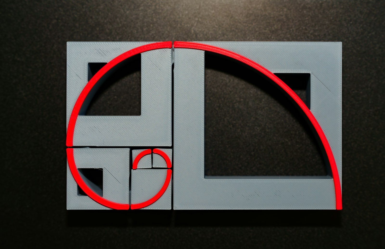
The golden ratio is a number: roughly 1.618, also written as the Greek letter phi. It shows up when a line gets split into two parts so that the ratio between the larger part and the smaller part matches the ratio between the whole line and the larger part. This number turns up naturally in the Fibonacci sequence and appears constantly throughout nature, in the arrangement of sunflower seeds, in the spiral of a seashell, even in the structure of galaxies. That’s why it’s been considered, for centuries, an inherently pleasing proportion to the human eye. Renaissance architects and painters, Leonardo da Vinci among them, were already using it deliberately in their work.
Applied to photography, the golden ratio produces a grid similar to the rule of thirds, but with uneven sections instead of equal ones, and it can be expressed as a spiral, known as the Fibonacci spiral or golden spiral. Instead of guiding the eye toward a fixed point, the spiral pulls it along a curved path toward the image’s point of interest, usually positioned near the tightest end of the spiral.
The practical difference between the two techniques comes down to how much finesse you’re going for. The rule of thirds is simpler to apply in the field, especially with the camera’s grid turned on, and it works well for quick decisions. The golden ratio takes a bit more planning, and shows up more in carefully built compositions or in crops made during editing, when there’s time to line the subject up along the curve of the spiral instead of just a straight line. A photographer tends to reach for the golden ratio when the scene already has elements that naturally curve, a winding road, the outline of someone in motion, and for the rule of thirds when time’s short or the scene is more geometric.
Horizon Line and Alignment
A crooked horizon bothers people even if they’ve never studied composition in their life. That’s because the human brain is constantly using level and gravity as reference points to orient itself in space; when a line that should be straight shows up tilted for no apparent reason, the image gives off an almost physical sense of imbalance, even if the viewer can’t quite explain why.
The simplest fix is using the camera’s grid as a visual reference at the moment you shoot, lining the horizon up with one of the horizontal lines. Plenty of cameras also have a built-in electronic level that shows in real time whether the camera is straight. When there’s no time to fix it in the moment, because you’re rushing or stuck with an awkward angle, it can be straightened later in editing: virtually every photo editor has a straighten tool that rotates and crops the image automatically.
There’s one important exception: tilting the camera on purpose, a technique known as the Dutch angle. Used with intent, it conveys tension, instability, or energy, and shows up a lot in action photography, dramatic scenes, and some sports coverage. The difference between an intentional tilt and a genuinely crooked horizon comes down to degree: a deliberate tilt tends to be pronounced and obvious, while a leveling mistake is usually a small, nagging tilt with no visual purpose behind it at all.
Other Key Principles
Beyond the principles already covered, three more tools show up constantly in well-built images.
Leading lines. These are elements in the scene, a road, a river, a fence, railroad tracks, even the direction someone in the shot is looking, that pull the viewer’s eye toward the main subject. Straight lines read as order and direction; curved lines tend to feel softer and more natural. When you’re framing a shot, it’s worth hunting for these elements in the scene and positioning them so they point exactly where you want the viewer’s eye to land.

Natural framing. This means using elements already in the scene as a frame around the subject: a doorway, an archway, tree branches, a window. It isolates the subject from the rest of the environment, adds a sense of depth, and helps pull attention inward, almost like the viewer is peeking at the scene through an opening.
Negative space. This is the empty or simple area around the main subject, a clear sky, a plain wall, a calm stretch of water. Instead of filling the entire frame, leaving room for the subject to “breathe” reinforces a sense of simplicity, isolation, or scale, and pulls more attention toward what actually matters in the image.
When to Break the Rules
None of these principles is an absolute law. They’re tools that help you make more deliberate decisions, and knowing them well is exactly what lets you set them aside when a scene calls for something different.
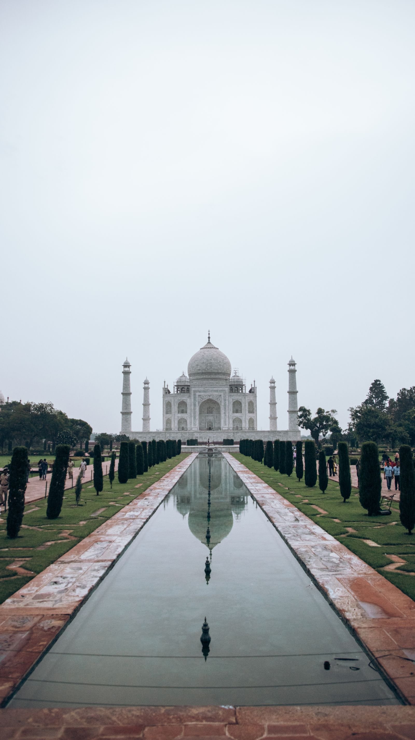
A dead-center composition, for instance, can be exactly what a symmetrical scene needs. Building facades, reflections in still water, hallways, structures with a central axis, these tend to gain power when the subject sits right in the middle of the frame, because the symmetry itself becomes the whole point of the image. The same goes for minimalist compositions, one small element surrounded by a lot of empty space: the goal there isn’t to follow the thirds grid, it’s to create a sense of isolation or scale.
The difference between breaking a rule by accident and breaking it on purpose comes down to how clear the decision reads. A subject centered by chance, in a scene with no symmetry or pattern to justify it, usually just looks careless. A subject centered deliberately, in a scene that earns that choice, reads as confident and intentional. The question that tends to separate the two is simple: if you couldn’t explain why you made that choice, it probably wasn’t a choice at all.
In sports photography, which is where I spend most of my time behind the camera, composition isn’t something you get to plan out calmly. The game, the race, the action doesn’t wait for you. Most of these calls get made in a split second, often before the play even happens: I’ve already had to pick my angle, leave space in the direction the athlete’s about to move, and guess where their body’s going to be the instant I hit the shutter.
That’s only possible because, after years of doing this, these principles stopped being a conscious checklist in my head and became reflex. I’m not thinking “rule of thirds” in the middle of a play. But my eye has learned to look for that space ahead of the motion, to avoid slicing the horizon through the middle of the frame, to notice when a line in the bleachers or the track can work as a leading line. Composition, at the end of the day, isn’t a formula you apply after the fact. It’s a way of seeing that gets built through practice, until it becomes part of how you look at any scene, camera in hand or not.
Keep Exploring
Composition is just one part of photography. If you want to keep exploring the other pillars, check out:
- The History of Photography — the full story, from cave paintings to digital sensors
- Camera and Lens Reviews — my hands-on take on every piece of gear I’ve shot with
- DSLR vs Mirrorless — the differences, the trade-offs, and where photography is headed
Sources
- Canon Snapshot Asia — How to Apply the Rule of Thirds in Portrait and Street Photography
- Digital Photography School — Rule of Thirds in Photography: The Essential Guide
- Digital Camera World — Golden Ratio Photography Composition Explained
- Digital Photography School — How to Use Leading Lines for Better Compositions
- Digital Photography School — Negative Space in Photography: The Essential Guide
- Fstoppers — Using (and Breaking) Composition Rules Intentionally